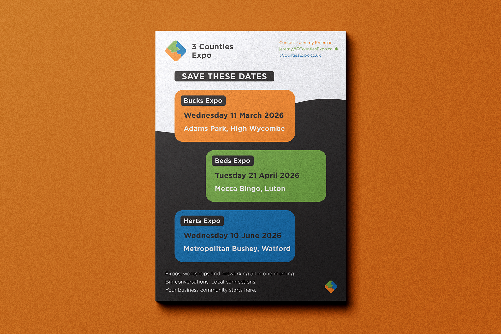
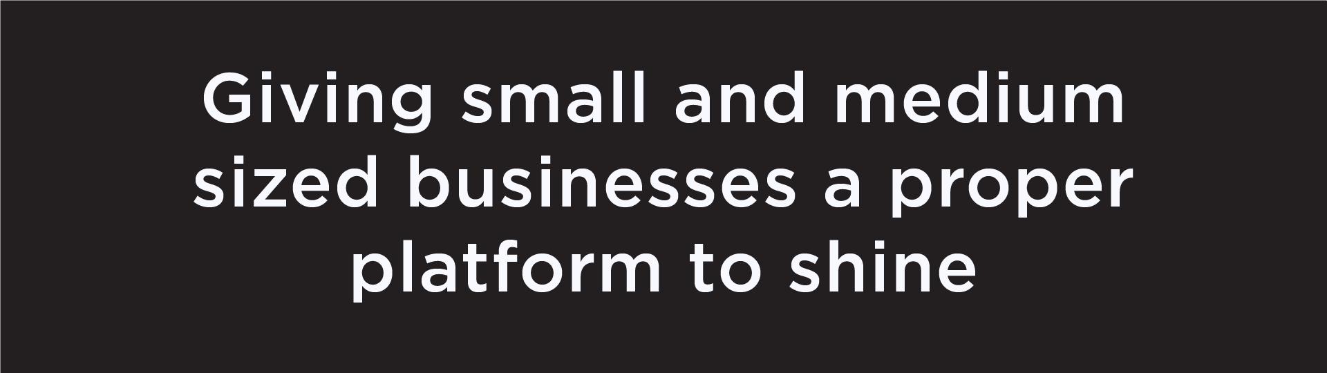
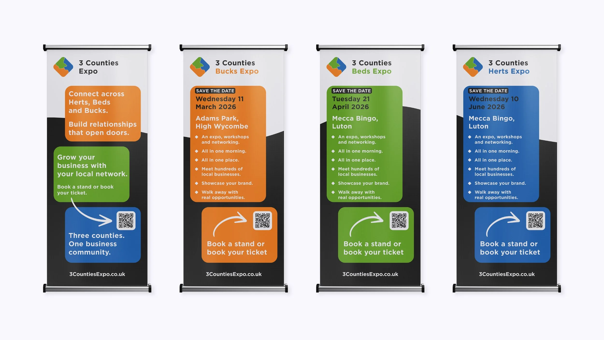
Bringing together businesses from Hertfordshire, Bedfordshire and Buckinghamshire.
I was approached to refresh the 3 Counties Expo brand as the events entered their next stage of growth. The goal was to modernise the visual identity while respecting the strong reputation, loyal audience, and regional purpose already in place.
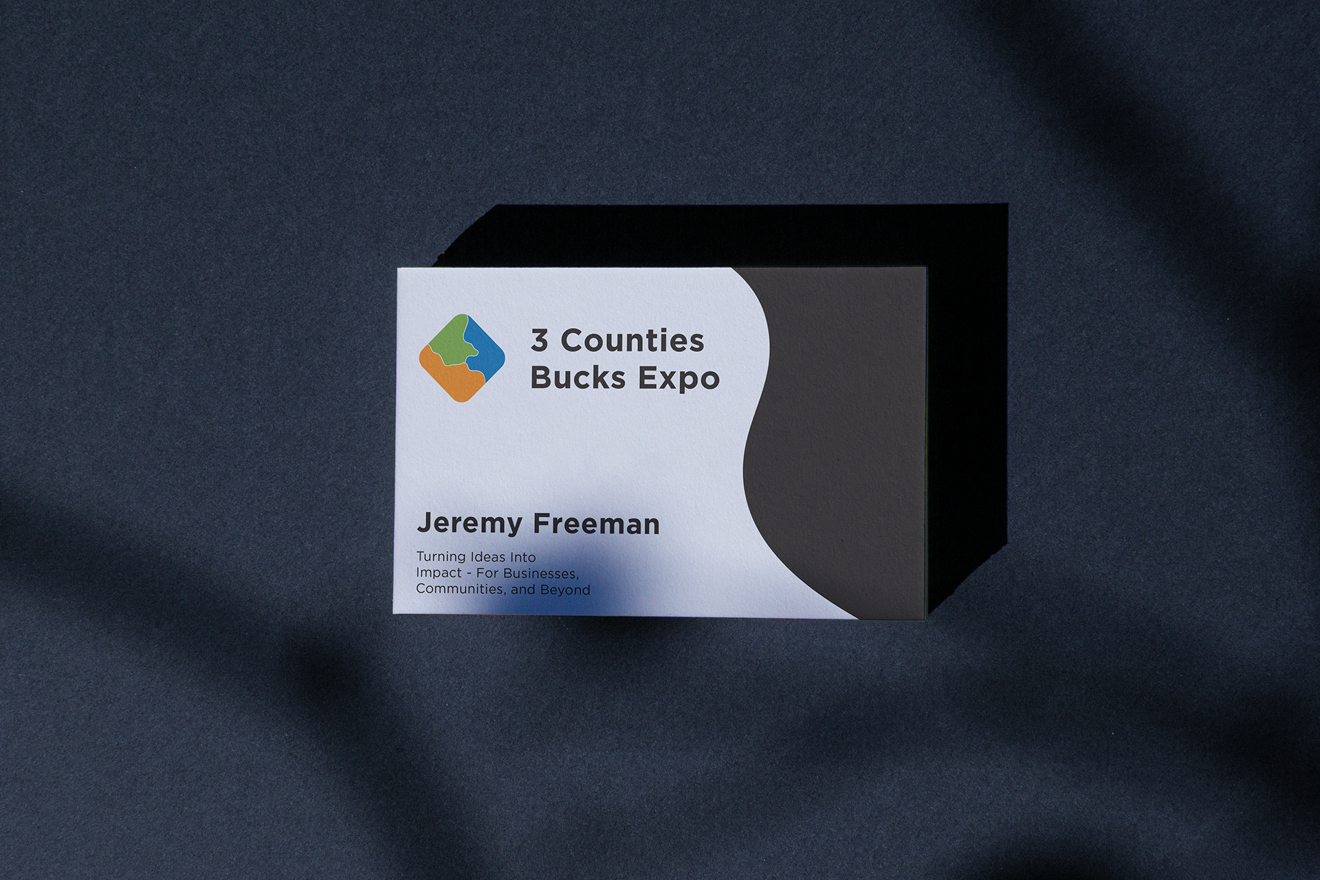
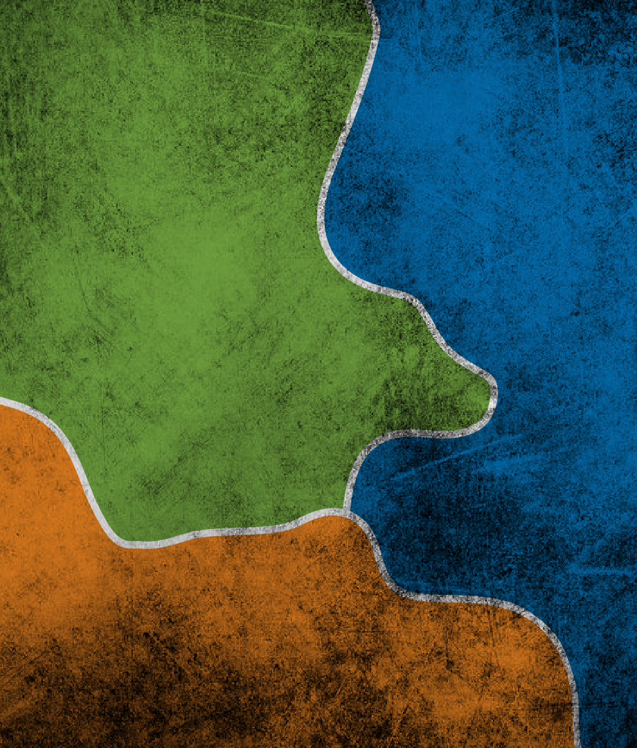
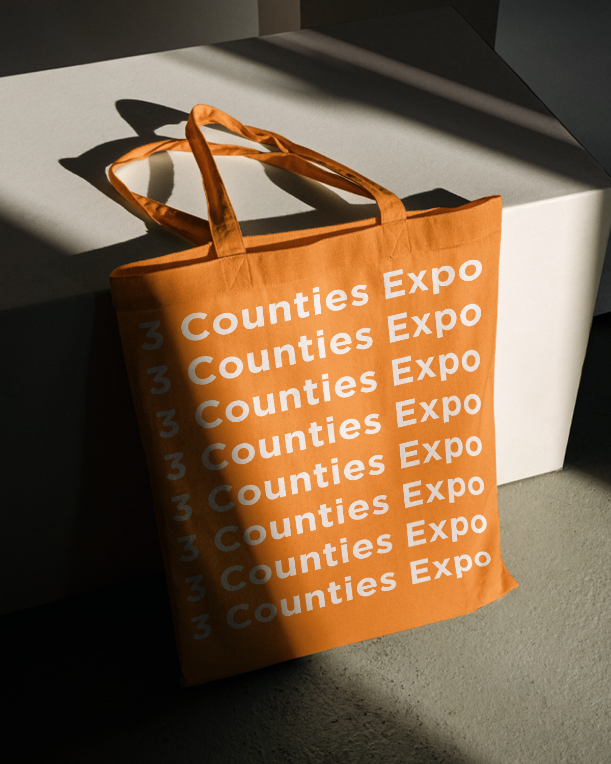
The refreshed brand introduces a clear colour identity for each county - Bucks, Beds, and Herts - allowing every event to feel distinct while remaining part of a unified system. The new visual language is professional, modern, and highly adaptable, designed to work seamlessly across print, digital, and web platforms.
The result is a refreshed identity that better reflects what the expos have become today and provides a strong foundation for future expansion.
Agency -
Echo & Form Studio
Role -
Branding, Logo Design, Brand Activation and Graphic Design.


Testimonial
Jonathan took my half-formed ideas and turned them into a clean, modern and meaningful brand identity for the 3 Counties Expo. He understood exactly what I was trying to achieve and translated messy thoughts into something professional, clear and easy to use across every platform.
His eye for detail and ability to make the complex feel simple, made the whole process a pleasure. I’m genuinely delighted with the result.
Jeremy Freeman - Organiser of the 3 Counties Expo